how did this forum used to look like?
-
Anubis

- Legendary

- Posts: 6429
- Joined: Tue Jun 21, 2005 7:57 pm
- Custom Title: Eletist Jerk
- Gender: Male
- Location: Crossroads, ganking a hordie lowbie.
- Contact:
how did this forum used to look like?
I wasn't here for all that long and people around here that the forum used to look different and it's bugging the heck out of me. Can any one show me how it used to look like?
-
Kirk Hammett

- Legendary
- Posts: 1496
- Joined: Wed Jul 06, 2005 9:02 am
- Custom Title: The Guitar Dude from Metallica
- Location: Planet Krypton (Or Australia)
- Contact:


-
Vuldari
- Legendary
- Posts: 3355
- Joined: Wed Dec 01, 2004 9:16 pm
- Custom Title: Aspiring "Reverse" Kitsune
- Gender: Male
- Location: Lakeville MN - (USA)
- Contact:
It was alot more grey and smooth...less bright NEON Blues and Yellows...and not so much harsh contrasts between the background and the sharp, thin light-blue box borders around EVERYTHING, like we have now.
...I liked the old scheme better... I still don't like this one. This one we have now makes my eyes hurt to look at.
New posts were also identified by Blue Full-Moons, while old posts were dark, faded New-Moons.
All I have saved from the old website is some of the MainPage "Splash Page" Art, and the Page headers.


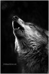
[Note: "Freeborn" was originally going to be titled "Devoured" untill the old script was tossed out the window and was redone from scratch for the "Freeborn" rewrite.
I know many of you were not here back then, so that should clear up any questions about the title on the first Pic. ]
This was from back before "THE PACK" even existed.
This was just a "Focus Group" web-forum for a Low-Budjet Slasher Flic back then. Not the community of Duckie Tossing Werewolf fans that it is today.


...I liked the old scheme better... I still don't like this one. This one we have now makes my eyes hurt to look at.
New posts were also identified by Blue Full-Moons, while old posts were dark, faded New-Moons.
All I have saved from the old website is some of the MainPage "Splash Page" Art, and the Page headers.
[Note: "Freeborn" was originally going to be titled "Devoured" untill the old script was tossed out the window and was redone from scratch for the "Freeborn" rewrite.
I know many of you were not here back then, so that should clear up any questions about the title on the first Pic. ]
This was from back before "THE PACK" even existed.
This was just a "Focus Group" web-forum for a Low-Budjet Slasher Flic back then. Not the community of Duckie Tossing Werewolf fans that it is today.
Please Forgive the Occasional Outburst of my Inner Sage ... for he is Oblivious to Sarcasm, and not Easily Silenced.
=^.^'= ~
=^.^'= ~

-
Silverclaw
- Moderator

- Posts: 3203
- Joined: Sat Nov 27, 2004 3:07 pm
- Gender: Male
- Mood: Meh...
- Location: Where soul meets body
That brings me back  I remember the old forum was really light colors, whites, grays or something. And their were a lot less topic thingys to go to. 'Building the Ultimate Werewolf' 'Non-Were Stuff' and 'Website Updates' 'Forum Updates' were the only ones around(I think)
hehe, I'd like to read the original script now
hehe, I'd like to read the original script now
-
outwarddoodles

- Moderator
- Posts: 2670
- Joined: Sat Apr 02, 2005 11:49 am
- Custom Title: I'm here! What more do you want?
- Gender: Female
- Location: Ohio
- Contact:
Heh heh, yeah, that brings me back.
I also remember the various forums were all set up in a different way -- and we even had a section devoted to describing the different characters. Obviously the forums have changed since then.
I even remember the time before we had all these awesome Wolf-Smiley edits.
*Hears collective gasp from crowd*
Yes, it's true. We didn't always have these lil' woofers here.
"We are not always what we seem, and hardly ever what we dream."
-
ABrownrigg

- Site Admin

- Posts: 1192
- Joined: Wed Nov 24, 2004 4:29 pm
- Contact:
-
Vuldari
- Legendary
- Posts: 3355
- Joined: Wed Dec 01, 2004 9:16 pm
- Custom Title: Aspiring "Reverse" Kitsune
- Gender: Male
- Location: Lakeville MN - (USA)
- Contact:
It just crossed my mind...
...I don't even know or remember what the MAIN page of this website looks like any more. I just have the forum bookmarked, and bypass it.
If there was some great new update on the Main page, I would not even know about it untill someone posted a message about it in here...THEN I would look.
*Looks at Main Page*
[Edit: Oh Yeah...Calypso-blue. You have to add "/ultimatewerewolf" to get to the main page. ...and then there is the "Freeborn" page too. ...I remember now...]
Last edited by Vuldari on Wed May 10, 2006 9:05 pm, edited 1 time in total.
-
Anook
- Legendary
- Posts: 1868
- Joined: Sun Apr 16, 2006 5:25 pm
- Custom Title: Dogs are miracles with paws
Well, I wasn't here when this forum first started, so I can't really complain about what I see here. I wish I could see what the old one looked like, but it really doesn't matter.
Oh, and some updates and changes might be good.
Oh, and some updates and changes might be good.
I could care less if I am a "freak". I don't care what other people think about me. I am me. I am different from the masses of society in unique and profound ways, anyway. Being physically different would trouble me not
-
Shadow Wulf
- Site Admin
- Posts: 7572
- Joined: Thu Jun 23, 2005 3:17 pm
- Location: Zephyrhills, Florida
- Contact:
-
Anook
- Legendary
- Posts: 1868
- Joined: Sun Apr 16, 2006 5:25 pm
- Custom Title: Dogs are miracles with paws
yea, I agree with you. I really don't mind this look. The colors aren't too bright. I like that.
I could care less if I am a "freak". I don't care what other people think about me. I am me. I am different from the masses of society in unique and profound ways, anyway. Being physically different would trouble me not
-
Vuldari
- Legendary
- Posts: 3355
- Joined: Wed Dec 01, 2004 9:16 pm
- Custom Title: Aspiring "Reverse" Kitsune
- Gender: Male
- Location: Lakeville MN - (USA)
- Contact:
Too much HIGH CONTRAST for my taste. I HATE the BabyBlue/SchoolBusYellow combo in the color scheme, and NOTHING is smooth and comforting. Everything is harsh.
...I still stand by my belief that EVERYONE ELSE is crazy, and I am the only one who sees how unpleasant this layout looks.
But this is just like it was when it was first changed. Everyone else praises the look of the page, while my Eyes bleed and I wonder what everyone else is looking at.
Not only that, but I remeber noticing that when the layout changed, the buttons and text at the bottom of threads ("NewTopic PostReply...") sometimes gets over-cluttered and the page tree will overflow into two lines instead of just one...but that NEVER happened on the old page.
...And the Dark Red virtical lines in the background (on the sides) are nearly invisable on my monitor...so I "Almost" see them, but not clearly, and my eyes strain trying to focus on them, even though I try to ignore them.
Regardless of what the rest of you think about the current page...I HATE IT. I did when it was first changed...and using it for months and months has not warmed me up to it. I am still not "used to it". I still hate it.
-
Silverclaw
- Moderator
- Posts: 3203
- Joined: Sat Nov 27, 2004 3:07 pm
- Gender: Male
- Mood: Meh...
- Location: Where soul meets body
-
Vuldari
- Legendary
- Posts: 3355
- Joined: Wed Dec 01, 2004 9:16 pm
- Custom Title: Aspiring "Reverse" Kitsune
- Gender: Male
- Location: Lakeville MN - (USA)
- Contact:
I'm talking about the buttons at the top and bottom of every thread, at the bottom of every post and the yellow "The Pack" and baby blue "www.longlivethepack.com" on the banner at the top of the page.
...and the thin blue borders around EVERYTHING, with black, dark blue, darker blue backgrounds...all under bright white text and white highlights...
PAINFUL CONTRAST
Black and white is one thing, but dark navy blue and neon colors are completely another.
...and the thin blue borders around EVERYTHING, with black, dark blue, darker blue backgrounds...all under bright white text and white highlights...
PAINFUL CONTRAST
Black and white is one thing, but dark navy blue and neon colors are completely another.

-
Shadow Wulf
- Site Admin
- Posts: 7572
- Joined: Thu Jun 23, 2005 3:17 pm
- Location: Zephyrhills, Florida
- Contact:
